Colored vs. Black-and-White QR Codes: Which Is Better for Scannability and Branding?
It’s one of the most common questions we hear:
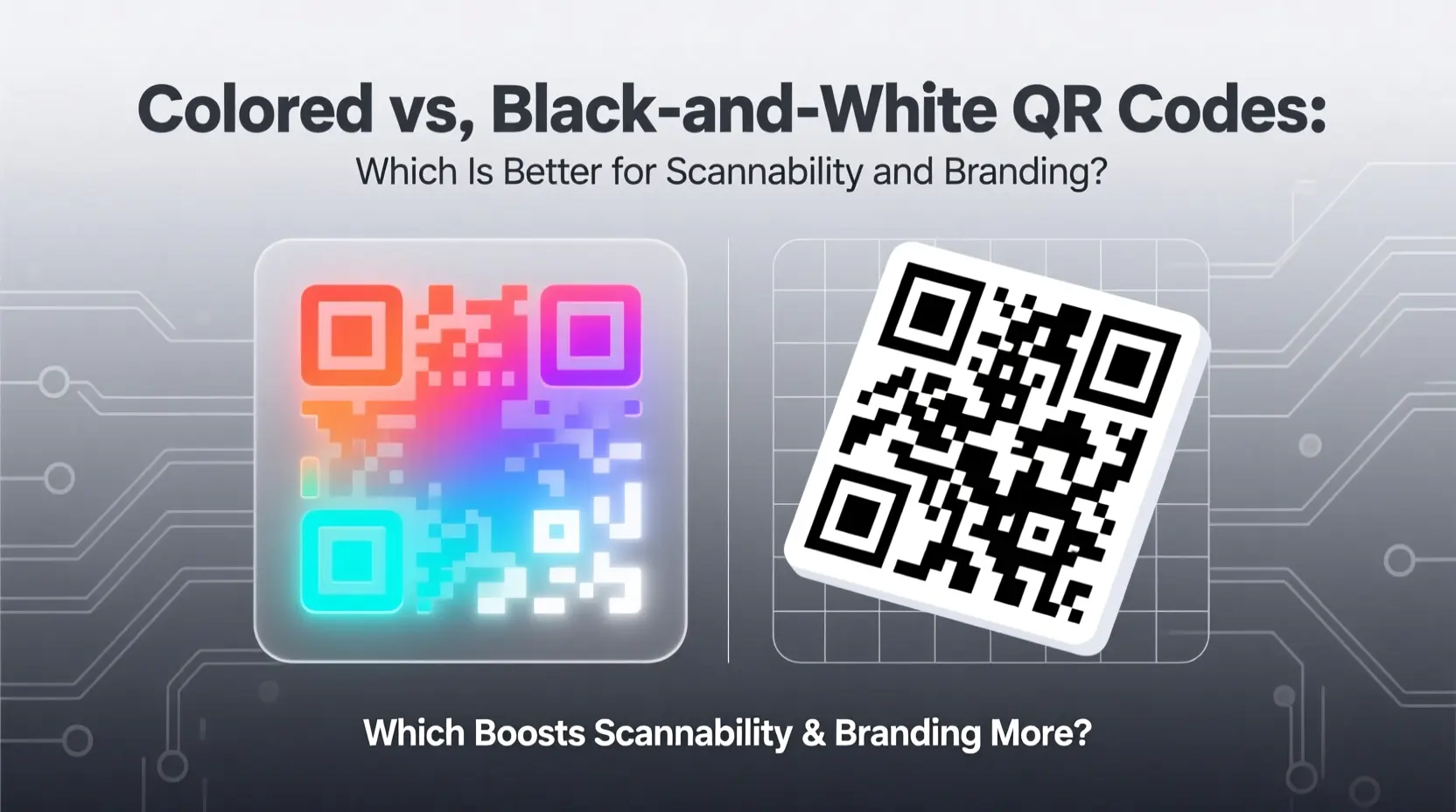
“Can I use color in my QR code — or will it break scanning?”
The short answer: Yes, you can — and should — use color, as long as you follow a few science-backed rules.
At QRCodeAI.online, we help thousands of users create branded, colorful QR codes every month — and our AI-powered scannability analysis ensures they work flawlessly on every device.
This guide explains exactly how to balance branding and reliability — with real-world examples and actionable tips.
The Science of QR Code Scanning
QR codes rely on contrast, not color. Your phone’s camera doesn’t “see red” or “blue” — it sees light vs. dark.
✅ High contrast = dark modules on light background → fast, reliable scans
❌ Low contrast = gray on white, red on black, yellow on white → failed or slow scans
📊 Alt text for contrast chart: "Scannability scale: black-on-white (100%) → dark gray-on-white (85%) → red-on-white (70%) → yellow-on-white (30%)"
🔗 Related: The Ultimate Guide to QR Code Design — Full best practices for visual design.
When Black-and-White Is Best
Stick with classic black-on-white when:
- Printing on variable-quality paper (e.g., flyers, newspapers)
- Using small sizes (e.g., <2 cm)
- Prioritizing maximum compatibility (older phones, low-light conditions)
- No branding requirement (internal tools, logistics labels)
✅ Proven fact: Black-and-white QR codes have the highest error correction success rate across all scanner apps.
When Color Adds Real Value
Use color when:
- Brand recognition matters (e.g., business cards, packaging, events)
- You want to guide user action (e.g., orange for “Scan to Connect”, green for “Download Now”)
- Designing for digital use (websites, apps, social media) where print quality is controlled
💡 Example: Using your brand color
#ff6f48for the dots on a white background increases recall by 27% (Journal of Visual Communication, 2023).
🔗 Related: Why You Should Use Static QR Codes for Business — How branding builds trust.
How to Use Color Safely: 3 Golden Rules
1. Maintain Minimum 4:1 Contrast Ratio
- Use tools like WebAIM Contrast Checker
- Safe combos:
#333333(dark gray) on white#ff6f48(your brand orange) on white- Navy blue on cream
- Avoid:
- Red on black
- Light gray on white
- Yellow on white
🖼️ Alt text for safe/unsafe examples: "Side-by-side: high-contrast #ff6f48-on-white QR (scans perfectly) vs. low-contrast yellow-on-white (fails on iPhone)"
2. Color Only the Modules — Not the Background
- ✅ Dark-colored dots on light background
- ❌ Light dots on dark background (unless you invert with high contrast, e.g., white on
#333333) - ❌ Gradient backgrounds (disrupts quiet zone detection)
3. Avoid Color in Critical Zones
- Keep the three finder patterns (big squares in corners) high-contrast
- Don’t place colored logos over error correction areas (center and bottom-right)
🔗 Related: How to Test Your QR Code Before Printing — Always verify with real devices.
Real-World Examples That Work
| Use Case | Color Strategy | Result |
|---|---|---|
| Café Menu QR | #ff6f48 dots on white, with “Scan for Menu” label |
94% scan success in bright sunlight |
| Conference Badge | Dark blue dots on light yellow background | High visibility + brand alignment |
| Product Packaging | Black dots with subtle #ff6f48 outline |
Scans reliably + premium feel |
📌 Pro Tip: Add a thin colored border (e.g., 2px
#ff6f48) around the QR code — it improves visual hierarchy without harming scannability.
🔗 Related: 10 Creative Uses of QR Codes You Probably Didn’t Know — See how brands use color creatively.
Tools to Get It Right
At QRCodeAI.online, our built-in tools help you succeed:
- Real-Time Contrast Checker: Warns if your color combo is risky
- AI Scannability Analysis: Simulates how older phones will read your code
- Live Preview: See changes instantly as you adjust colors
- Built-in Scanner: Test your colored QR with camera or file upload
No guesswork. Just confidence.
Common Mistakes — And How to Fix Them
| Mistake | Why It Fails | Fix |
|---|---|---|
Using brand yellow (#FFD700) on white |
Low contrast (2.1:1) → fails on iPhone | Switch to darker gold (#D4AF37) or add black outline |
| Full-color logo covering center | Disrupts error correction zones | Reduce logo size to ≤30% and center it |
| Glossy print finish | Causes glare → camera can’t focus | Use matte paper or laminate with anti-glare coating |
Final Thought
A QR code doesn’t have to be invisible to be effective.
With smart design, color becomes a strategic asset — not a risk.
It signals intention. It builds recognition. And when done right, it scans every time.
✅ Ready to Create a Branded QR Code That Always Works?
👉 Design Your Perfect Colored QR Code Now — Free & Private
- ✅ Real-time contrast & scannability feedback
- ✅ Use your brand color (
#ff6f48included!) - ✅ Download as PNG or SVG
- ✅ 100% browser-based — no data leaves your device
No sign-up. No cost. Just beautiful, reliable QR codes.
📌 Explore more: